The 1880s were a time of great progress in America. Railroads crisscrossed the country with over 11,500 miles of track connecting major cities and allowing for the quick transport of perishable products. No longer limited to a local market, citrus fruit, grapes and raisins grown in California, plums, cherries, pears, apples and yams from Washington State and Oregon, Florida citrus and vegetables from Texas were able to be enjoyed nationwide.
To insure that products arrived intact, fruits and vegetables were packed in sturdy wooden crates which were labeled with the contents, packer’s name and the location where the food was grown. Very early crates had their information stamped in ink on the end. It was simple and to the point. But that labeling was to be short lived.
Realizing that the groceries in the east and the midwest were displaying their produce in their shipping crates, the original bland labeling soon gave way to beautifully crafted labels. Catchy slogans, vivid colors and finely detailed stone lithography were used to create paper labels that would become a highly effective marketing tool and turn plain wooden crates into an instant collectible.
The talented artists who created crate art were seldom credited for their work. Many were German immigrants who had relocated to Chicago and New York to study commercial art and then headed west to California to work for the large printing houses. Companies like Schmidt Litho of San Francisco and Western Lithograph located in Los Angeles hired hundreds of these skilled artists during the late 1800s and the early part of the 1900s. Not only were they never credited for their work, but the beautiful labels they produced were marked with the name of the printing company.
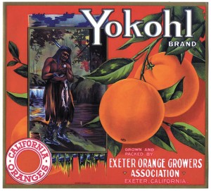
Although forced to work anonymously, the crate art of the early immigrant artists is highly recognizable as they portrayed their romanticized impressions of life in the United States. Much of their work included images of cowboys and Indians, chubby cheeked Victorian children and “pin-up” girls. Their art has a feeling of optimism and reflects their dreams of success in their new home in America.
Crate labels from the 1920s were less interpretive of life in the new world and more about the contents of the crate. Since fruits and vegetables are highly perishable the labels became more eye-catching in an attempt to sell the produce more quickly. Some producers used images of dragons, lions, bears, mountain goats, wolves and horses to call attention to their products. Others depicted scenes of Americana like bucking broncos or pictures of the Gold Rush. In some cases labels were created with a specific regional destination in mind. For example, California grapes had a large following among the Italian neighborhoods on the east coast. These labels are easily identified by their ethnic themes and images.
Original label images were painted with watercolors on paper or linen then lithographs would be produced on Bavarian stone (1880-1920) or magnesium (1920-1950). It was a common practice for printers to run a few examples to be proofed before they went into mass production. Printer’s samples are a rare find and have been known to bring as much as $200 at specialized auctions.
As we entered the 1940s label designs became more commercial with geometric patterns and bold letting replacing graphic art. The number of crates produced dropped drastically and, with the advent of the cardboard box in 1950, the once irreplaceable wooden shipping crate became obsolete.
Condition, rarity and subject matter are the major determinants of value in this category of collecting. At this time we are experiencing a buyer’s market as supply well out weighs demand. If you are drawn to the charm and artistic value of produce crates from 1880-1950 this would be a great time to watch for them as you hit the summer sales. Until next time . . . Linda
Linda Kennett is a professional liquidation consultant specializing in down-sizing for seniors and the liquidation of estates. Linda is not taking clients at this time.